Join a vibrant network where opportunity meets action
Client
Ingroup
Tools
Figma
Services
UX Design & Research, Prototyping, Logo, Branding
Project Overview
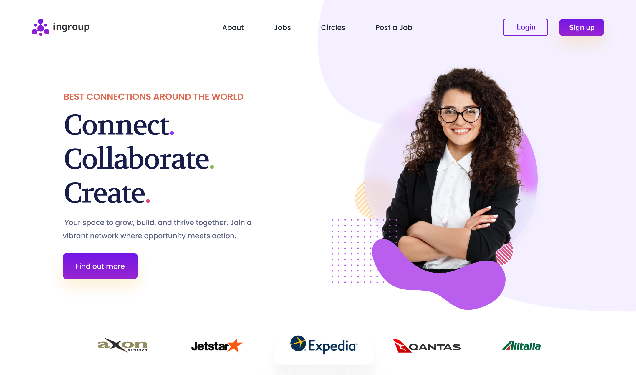
As a UI/UX designer, I embarked on the design journey for Ingroup, a professional networking platform designed to help people connect, grow, and collaborate within meaningful communities — much like LinkedIn, but with a sharper focus on cohorts, peer-to-peer mentoring, and group-driven interactions.
Ingroup was born from a simple insight: while many platforms connect people professionally, they often lack genuine peer group dynamics, guided knowledge exchange, and trust-based cohorts. My role was to design a platform that would bridge this gap — intuitive, engaging, and tailored to help people not just grow careers, but grow together.
Goal
The primary goal was to design a responsive web app that facilitates:
- Professional networking and discovery
- Cohort-based learning and collaboration.
- Mentorship programs, events, and content sharing.
- A human-first, clean, and minimal UI to encourage real engagement.
Empathize
- Conducted user interviews with professionals, freelancers, and students.
- Ensuring Secure Document Verification
- Understood the need for safe, cohort-based groups for learning and sharing.
Define
- Created user personas
- Mapped core needs like: trusted connections, exposure, peer feedback, and relevant opportunities.
- Defined the product structure around cohorts, profiles, feeds, and networking utilities.
Ideate
- Held design studio sessions with stakeholders and users.
- Sketched user flows for onboarding, profile building, feed engagement, cohort formation, and direct messaging.
- Prioritized features based on user impact vs. effort (MoSCoW method).
Design
- Built a design system with scalable components: cards, tabs, modals, avatars, and buttons — ensuring consistency across the app.
- Created high-fidelity Figma prototypes
- Used a neutral, friendly color palette to promote inclusivity and reduce visual fatigue
Test
- Ran multiple usability tests with users in different industries.
- Identified areas for improvement: cohort discovery was unclear, event creation needed better labeling.
- Iterated the flows, simplified content hierarchy, and introduced progressive onboarding.
Key Features
Cohort-Based Communities:
Private and public groups where users collaborate and grow together.
Content Creation Tools:
Share posts, documents, or external links easily.
Smart Discovery:
AI-based recommendations for cohorts, jobs, and people.
Interactive Feed:
Tailored content stream per cohort and global feed.
In-App Messaging:
DM individuals or group chats with cohorts.
Event Hub:
Host or join events, webinars, and mentorship sessions.
Growth Tracker:
Visual indicators of participation, endorsements, and impact.
Designs - Click through Prototype (Figma)
Challenge
- Designing Cohorts Intuitively: Balancing privacy, relevance, and ease of discovery without creating cognitive overload.
- Avoiding LinkedIn Clones: Keeping the interface unique yet familiar — we focused on minimalism, warmth, and clarity.
- Keeping Users Engaged: Unlike large networks, small cohorts risk drop-off — so we baked in reminders, micro-rewards, and onboarding flows that encourage participation.
Outcome
The final prototype was tested with a diverse set of users — from students to senior professionals — and the feedback was overwhelmingly positive:
- 92% found the UI clear and inviting.
- 86% said they’d use it weekly for meaningful conversations.
- Key cohorts like “Women in UX”, “Remote Developers” and “Startup Founders” became active test groups with over 80% engagement in the first 14 days.
Takeaways
- Design for Depth, Not Just Scale: Smaller, more relevant interactions often beat mass networking.
- Guided Onboarding Matters: A smooth first-time experience sets the tone for engagement.
- Cohorts Are the Future: People want to grow with others who understand their context.
- Keep UI Warm & Human: Especially for professional tools, emotional design builds trust and adoption.